

create accessible
LINKS
Goal
The clear goal for any link is straightforward: users must instantly understand where the link will take them and be able to activate it easily, regardless of how they navigate (mouse, keyboard, touch, or screen reader). An accessible link must have descriptive text (Link Purpose), be visually distinguishable from regular text (Contrast/Visual Cues), and provide clear feedback when it receives keyboard focus.
Benefits
Inaccessible links create confusion and frustration that can completely derail a user's experience. When links are ambiguous or invisible to certain users, they can't complete critical tasks like navigating to important pages, downloading resources, or finding contact information. Focusing on accessible link design delivers essential benefits:
Clear Navigation
Descriptive link text tells everyone—including screen reader users—exactly where a link leads before they click it. Instead of having to hear "click here" repeated dozens of times, screen reader users should hear meaningful phrases like "Download 2024 Annual Report" or "Contact Customer Service," allowing them to navigate efficiently and confidently.
Keyboard Focus
People who navigate using only a keyboard rely on the Tab key to move between links. A visible focus indicator (the outline that appears around the link) shows them exactly where they are on the page. Without this visual cue, keyboard users are essentially navigating blind, forced to guess which element currently has focus.
Reduced Cognitive Load
When link text clearly describes its destination, users don't need to read surrounding context to understand where they're going. This speeds up navigation for everyone, especially users with cognitive disabilities who benefit from clear, predictable information.
What To Do
Since we assume your website builder uses proper semantic link code, accessibility compliance rests primarily on your content and design choices.
Use Descriptive, Meaningful Link Text
The text inside your link is what screen readers announce and what all users rely on to predict where the link leads.
Be Specific and Action-Oriented
Link text must clearly describe the destination or action. Use phrases like "Read our Privacy Policy," "Download the Pricing Guide," or "View Shipping Options"—not vague phrases like "Click Here," "Read More," or "Learn More."
Make Links Understandable Out of Context
Screen reader users often navigate by pulling up a list of all links on a page. When they hear just the link text without surrounding content, it must still make sense. A link that says "here" or "this page" becomes meaningless in a list.
Avoid Repeating the Same Link Text
If you have multiple links that say "Learn More," screen reader users can't distinguish between them. Instead, make each link unique: "Learn More About Our Services," "Learn More About Pricing," "Learn More About Support Options."
Don't Use URLs as Link Text
Raw URLs like "www.example.com/products/pricing" are difficult for screen readers to announce and hard for all users to understand. Instead, use descriptive text like "View our pricing page."
Keep It Concise
While link text should be descriptive, it shouldn't be an entire sentence. Aim for 2-8 words that clearly convey the destination without overwhelming users.
Ensure Links are Visually Distinguishable
Links must look different from regular text so all users can identify them as clickable elements.
Underline Links in Body Text
The most universally recognized indicator that text is a link is an underline. While navigation menus and buttons have different conventions, links within paragraphs and body content should maintain underlining for maximum clarity.
Alternative to Underlines
If you choose to remove underlines for aesthetic reasons, you must meet two specific requirements:
The link text must have a contrast ratio of at least 3:1 compared to the surrounding non-link text
The link must display a visual change (beyond just color) when it receives keyboard focus or mouse hover—such as an underline appearing, text becoming bold, or a background color change
Link Color Contrast
Link text must have sufficient contrast against its background. For standard-sized text, maintain at least a 4.5:1 contrast ratio between the link color and the background color.
Provide a Clear Focus Indicator
When a keyboard user tabs to a link, a visual indicator must appear to show them where their focus is located.
Never Remove the Focus Outline
The default focus ring that appears around links when you press Tab is critical for keyboard accessibility. Never hide it using CSS or style overrides, even if you think it looks unappealing.
Ensure Focus Indicator Contrast
The focus indicator itself must have at least a 3:1 contrast ratio against the adjacent colors (either the background or the link's normal state). This ensures users with low vision can clearly see which link currently has focus.
Customize Thoughtfully
If you want to customize the focus indicator to match your brand, that's fine—just ensure it remains highly visible and meets contrast requirements. A thicker border, bright outline color, or background color change are all acceptable alternatives.
Target Size for Touch Users
While links in body text are often smaller and in sentence context, standalone links or navigation links should meet minimum touch target sizes.
Standalone Links
Links that stand alone (not embedded in sentences) should have a clickable area of at least 24x24 pixels, including padding. This applies to navigation menus, footer links, and button-style links.
Adequate Spacing
Ensure sufficient spacing between adjacent links to prevent accidental clicks, especially on mobile devices.
Example
The Scenario
A common accessibility failure occurs when websites prioritize minimalist aesthetics over usability, stripping away the visual cues that make links identifiable and navigable.
The Failure
A marketing agency is designing a portfolio website with a clean, modern aesthetic. To achieve a minimal look, they make the following design choices:
Issue 1: Generic Link Text: Throughout the site, project descriptions end with a link that simply says "View Project." When a screen reader user pulls up a list of all links on the page, they hear "View Project" repeated 12 times with no way to distinguish which project each link refers to.
Issue 2: No Visual Distinction: The designer removes underlines from all links and styles them in a subtle gray that's only slightly darker than the regular body text. The contrast between the link color and surrounding text is 2.5:1—failing the required 3:1 minimum. Visitors with low vision can't tell which words are clickable.
Issue 3: Hidden Focus Indicator: To maintain the minimal aesthetic, the developer adds CSS that removes the focus outline. Keyboard users who tab through the page have no visual indication of which link currently has focus, making navigation nearly impossible.
Issue 4: Hover-Only Visual Cue: The only way to identify links is to hover over them with a mouse, which does nothing for keyboard users, touch screen users, or anyone using assistive technology.
The Solution
The agency can maintain their modern, clean aesthetic while achieving full accessibility by making strategic adjustments:
Descriptive Link Text
Change generic links to be specific: "View Cityscape Branding Project," "View E-commerce Website Design," "View Nonprofit Annual Report Design." Now screen reader users can navigate confidently, and all users understand where each link leads.
Add Visual Distinction
Keep the clean gray link color but add a subtle underline, or increase the link color contrast to meet the 3:1 minimum against body text. Both approaches maintain the modern aesthetic while making links clearly identifiable.
Restore Focus Indicators
Implement a custom focus style that fits the brand—perhaps a thin, high-contrast outline or a subtle background color change—ensuring at least 3:1 contrast. Now keyboard users can see exactly where they are as they navigate.
Test with Keyboard Only
The designer navigates the entire site using only the Tab key to verify that focus is always visible and that all interactive elements can be reached and activated without a mouse.
WCAG Conformance Levels
Level A (Minimum)
Links must have text or alternative text that describes their purpose
Links must be keyboard accessible (can be reached and activated using Tab and Enter keys)
Link purpose must be determinable from the link text or its surrounding context
Level AA (What's Really Expected)
Level A criteria PLUS:
The link text itself must clearly indicate its purpose without needing surrounding context
Link color must maintain at least 4.5:1 contrast ratio against the background
If links are not underlined, they must have at least 3:1 contrast ratio against surrounding text AND provide a non-color visual cue on focus/hover
The focus indicator must be visible and have at least 3:1 contrast ratio against adjacent colors
Standalone links should have a minimum target size of 24x24 pixels
Level AAA (Over Achiever)
Level A and AA criteria PLUS:
Link text alone (without any context) must fully describe the link's purpose
Link color contrast should be at least 7:1 against the background
Standalone links should have a minimum target size of 44x44 pixels
Section headings can be used to organize links and make navigation more efficient
Recommended Digital Accessibility Resources
Web Accessibility Initiative
To geek out and go deep on the history and technical criteria for WCAG (Web Content Accessibility Guidelines) W3C is the resource for you.
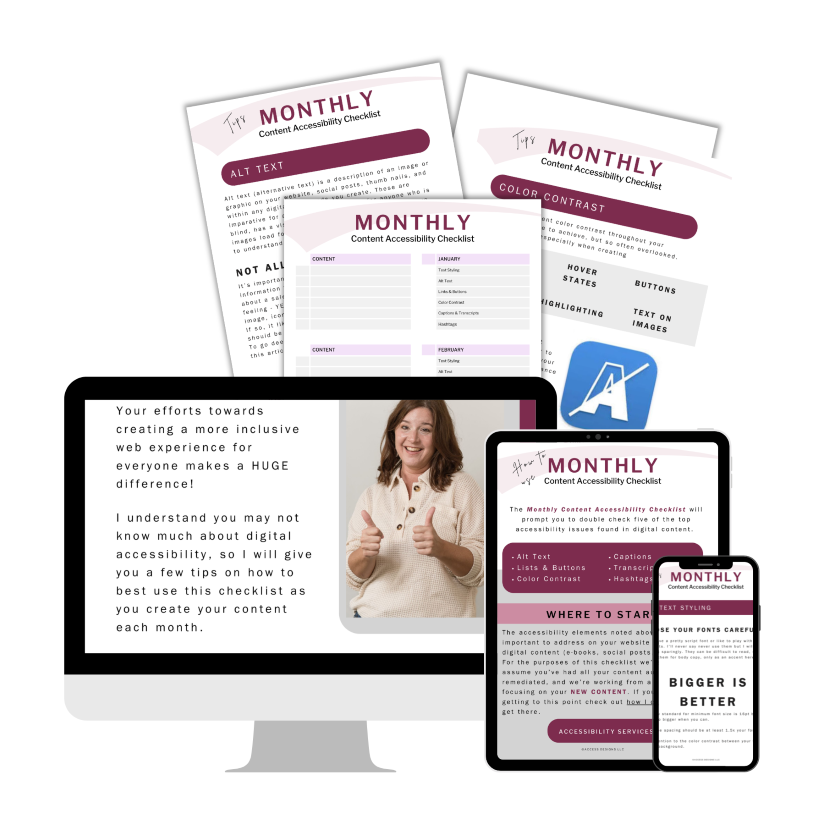
Monthly Content Accessibility Checklist
Easy first steps to track and integrate accessibility into the digital content you create on a regular basis for your business.

Color Contrast Anylyzer
FREE easy to use tool that helps you verify the color contrast throughout your website.
The accuracy of information on this website is subject to change. Implementing these accessibility tips by no means ensures your website is fully compliant with current guidelines or laws. You should consult with a professional to audit and/or remediate your site and obtain an accessibility statement.
© 2025 Access Designs LLC | All Rights ReservedLegal ▸ Privacy Policy ▸ Terms ▸ Accessibility Statement