

create accessible
Color Contrast
Goal
The purpose of color contrast for accessibility is meant to ensure that text, images, and interactive elements can easily be distinguished from its background for people who are blind, color blind or have other visual impairments and some cognitive challenges.
Benefits
Poor color contrast is one of the most common accessibility failures on websites, yet it's also one of the easiest to prevent. Prioritizing sufficient contrast delivers significant benefits across your entire user base.
Universal Readability
When text has strong contrast against its background, everyone can read it more easily and comfortably. This includes users with low vision, color blindness, aging eyes, or anyone viewing your site on a phone in bright sunlight. High contrast reduces eye strain and makes content consumption effortless for all visitors.
Clear Interface Navigation
Buttons, form fields, icons, and other interactive elements must be visually distinct from their surroundings. When these UI components have adequate contrast, users can quickly identify where to click, tap, or interact—reducing confusion and improving task completion rates for everyone, especially users with visual impairments.
Professional Credibility
Websites with poor contrast appear amateurish and difficult to use. Strong contrast signals attention to detail and user experience, building trust and credibility with your audience.
What To Do
Color contrast requirements apply to two main categories: text content and user interface components. Your website builder handles the code, but you control the colors—which means accessibility compliance rests entirely on your design choices.
Text Contrast Requirements
All text on your website must have sufficient contrast against its background to be easily readable.
For body text and any text smaller than 18 point (or 14 point bold), maintain a contrast ratio of at least 4.5:1 between the text color and background color.
Text that is 18 point or larger (or 14 point bold or larger) has slightly relaxed requirements and needs only a 3:1 contrast ratio. Large text is naturally easier to read, so the threshold is lower.
Images of Text
If you include text embedded within an image (such as promotional graphics or infographics), that text must also meet the same 4.5:1 contrast ratio. However, best practice is to avoid images of text entirely when possible—use actual text on your page for better accessibility and SEO.
User Interface Components
Beyond text, interactive elements and graphical objects must also be visually distinguishable to ensure users can identify and interact with them.
Interactive Elements
Buttons, links, form input fields, checkboxes, radio buttons, and other interactive components must have a contrast ratio of at least 3:1 against adjacent colors. This includes:
The border or outline of the component against its background
The component itself against the surrounding page background
Visual indicators that show a component's state (such as a selected checkbox)
Focus Indicators
When a keyboard user tabs to an element, the focus indicator (outline or border) must have at least a 3:1 contrast ratio against the element's background or the adjacent colors. This ensures keyboard users always know where their focus is located on the page.
Graphical Objects
Icons, charts, graphs, and other visual elements that convey information must have 3:1 contrast against adjacent colors. This applies only to graphics that are essential for understanding content—purely decorative graphics are exempt.
Inactive Elements Exception
Disabled or inactive components (such as a grayed-out "Submit" button before a form is complete) are exempt from contrast requirements, as they are intentionally not available for interaction.
How to Check Your Contrast
You don't need to calculate contrast ratios manually. Use free tools like the WebAIM Contrast Checker or browser extensions that test contrast automatically.
Color is Not Enough
Never rely on color alone to convey information or indicate an action. Always pair color with another visual indicator like text, icons, patterns, or underlines. For example:
Error messages should include text like "Error:" along with red color
Required form fields should be marked with an asterisk (*) and the word "Required," not just red color
Links should be underlined or have sufficient contrast with surrounding text (3:1 minimum)
TIP: I suggest testing all color contrast combinations when setting up your website style guide so you can adjust where needed once and than know you are set!
Example
The Scenario
A wellness coach is building a website for their coaching practice, choosing a calming sage green and cream color palette to reflect their brand's peaceful, natural aesthetic.
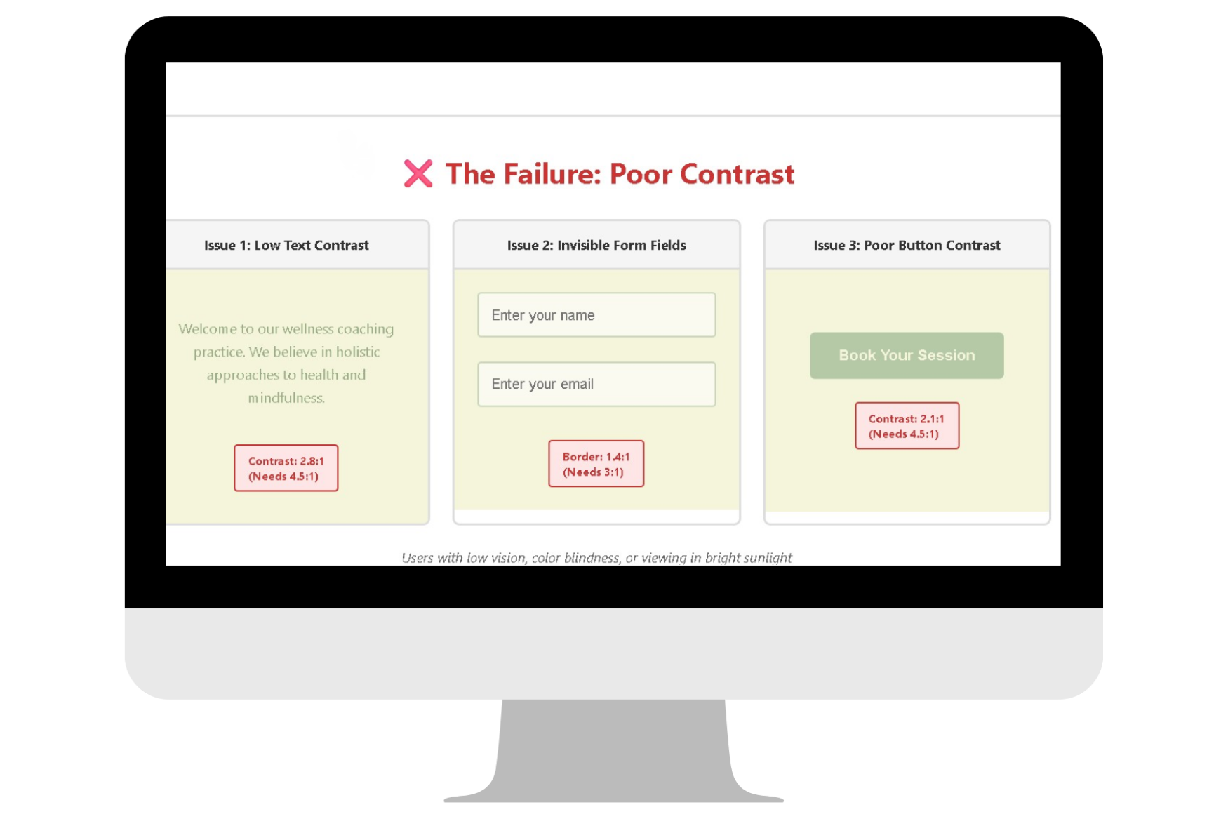
The Failure
To maintain a soft, cohesive look throughout the site, the designer makes these color choices:
Issue 1: Low Text Contrast: The main body text is styled in a muted sage green (#9CAF88) on a cream background (#F5F5DC). When tested, this combination produces only a 2.8:1 contrast ratio—failing the required 4.5:1 minimum for standard text. Visitors with low vision or color blindness struggle to read paragraphs of content, causing them to leave the site in frustration.
Issue 2: Invisible Form Fields: Input fields on the contact form have a light cream background (#FAFAF0) with a very pale sage green border (#C8D5B9). The border contrast against the cream page background is only 1.4:1, far below the required 3:1. Users can't distinguish where the input fields begin and end, making form completion nearly impossible for people with visual impairments.
Issue 3: Poor Button Contrast: The "Book a Session" call-to-action button uses cream text (#F5F5DC) on a light sage background (#B5C9A6), producing a contrast ratio of only 2.1:1. The button essentially disappears into the page for users with low vision, hiding the site's most important conversion action.
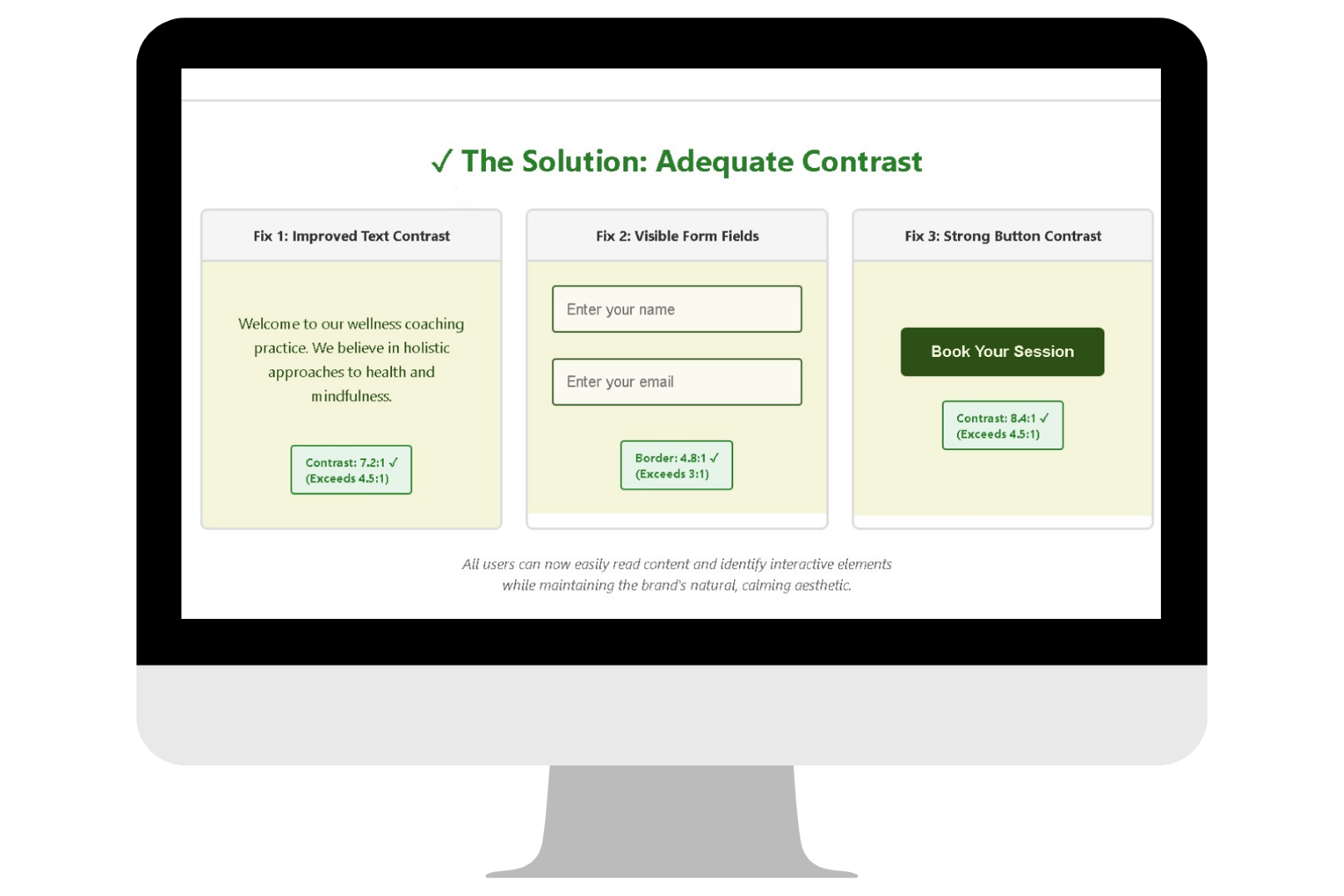
The Solution
The wellness coach can preserve their calming brand aesthetic while meeting accessibility standards through strategic color adjustments:
Improve Text Contrast
Replace the muted sage green text with a deep forest green (#2D5016) for body copy. This achieves a 7.2:1 contrast ratio against the cream background—exceeding even the AAA standard of 7:1 while still feeling natural and on-brand.
Define Form Fields Clearly
Change the input field border to the same deep forest green (#2D5016), creating a 4.8:1 contrast ratio against the cream background. Now the fields are clearly visible and users can easily identify where to enter information.
Strengthen Button Visibility
Redesign the primary call-to-action button with a deep forest green background (#2D5016) and cream text (#F5F5DC), producing an 8.4:1 contrast ratio. The button now stands out as the focal point on every page while maintaining the natural color story.
Add Non-Color Indicators
Include the text "Required" next to asterisks, add error message text that says "Please complete this field," and use icons alongside color indicators. Now all users can understand validation requirements regardless of color perception.
Test and Verify
The designer uses a contrast checker tool to verify all color combinations throughout the site, ensuring every text element and interactive component meets minimum requirements before launch.
WCAG Conformance Levels
Level A (Minimum Standard)
Color is not the only visual means of conveying information, indicating an action, prompting a response, or distinguishing a visual element
Level AA (What's Really Expected)
Level A criteria PLUS:
Standard-size text (smaller than 18pt or 14pt bold) must have a contrast ratio of at least 4.5:1 against its background
Large text (18pt or larger, or 14pt bold or larger) must have a contrast ratio of at least 3:1 against its background
User interface components (buttons, form fields, focus indicators) must have a contrast ratio of at least 3:1 against adjacent colors
Graphical objects that convey meaningful information must have a contrast ratio of at least 3:1 against adjacent colors
Level AAA (Over Achiever)
Level A and AA criteria PLUS:
Standard-size text must have a contrast ratio of at least 7:1 against its background
Large text must have a contrast ratio of at least 4.5:1 against its background
Web Accessibility Initiative
To geek out and go deep on the history and technical criteria for WCAG (Web Content Accessibility Guidelines) W3C is the resource for you.
Recommended Digital Accessibility Resources
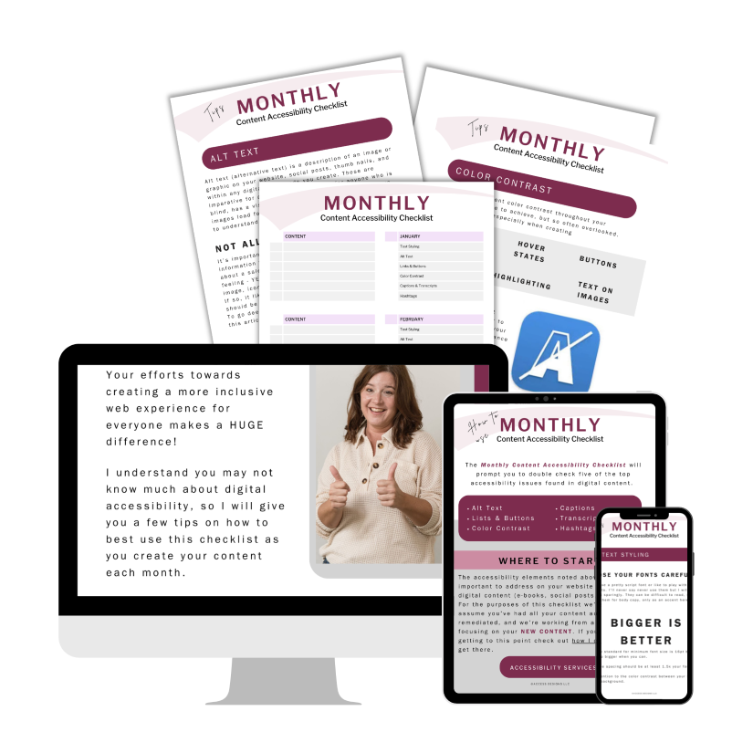
Monthly Content Accessibility Checklist
Easy first steps to track and integrate accessibility into the digital content you create on a regular basis for your business.
Color Contrast Anylyzer
FREE easy to use tool that helps you verify the color contrast throughout your website.

The accuracy of information on this website is subject to change. Implementing these accessibility tips by no means ensures your website is fully compliant with current guidelines or laws. You should consult with a professional to audit and/or remediate your site and obtain an accessibility statement.
©Access Designs LLC | All Rights ReservedLegal ▸ Privacy Policy ▸ Terms ▸ Accessibility Statement